QR Codes in Catalogues: How Retailers are Pulling Prospects Off the Page
 The ink needed to print a QR code on a major retailer’s catalog might weigh only a fraction of an ounce, but when used right, it’s worth its weight in gold. Too bad the majority of catalogs seem to be squandering the opportunity by underutilizing the code or worse, not including any at all. In a world where an integrated multi-channel approach is a must-have for any retailer to survive, the stakes of leveraging every opportunity for interaction are higher than ever.
QR: The Bridge to the Modern World
Involvement devices have come a long way from the time of Ed McMahon’s Publisher’s Clearinghouse mailings, where you would peel off a label and stick it onto another page before dropping it back in the mail with visions of Ed showing up at your doorstep some day soon.
Today, print’s best involvement device is the QR code. It works as a portal or bridge into the mobile online world where the cataloger’s brand lives and breathes in real time. Even better, it can lead the customer from the catalog page to the checkout button on their smartphone within minutes.
The printed catalog delivers rich colors and a personal, tactile experience still not attainable through any mobile device. In many ways, though, it is a vestige of a bygone era. And an expensive one at that. Catalogers know this. Even the U.S. Postal Service (also a vestige of a bygone era) knows this. That’s why the USPS is running a postage discount promotion for the second year in a row this summer to encourage the use of QR codes by direct mailers.
So, let’s take a quick look at the way a few catalogers are using QR codes. With hundreds of catalogers mailing version after version to their lists, this is a very small, somewhat random sample, indeed. However, the three we’re looking at already show how varied the use of QR codes can be—and what that might imply for their results.
Delia’s
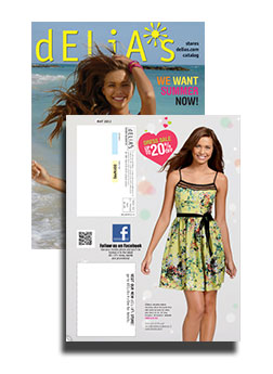
By appealing to fashion-hungry American teens via retail stores, web, and catalog, Delia’s sold over $220 million in 2011. In the single catalog we looked at, Delia’s had a QR code on its back cover. When scanned, the code points to Delia’s Facebook page. That’s certainly one way to build involvement with the Delia’s brand, but it may not be the best. Delia’s has an Apple app with full e-commerce capabilities, so Delia’s could be missing out on the opportunity to help the customer cut to the chase and get straight to their virtual shopping bag. Still, at least they’re using the code.
Anthropologie
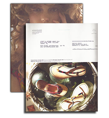
 Some say that Anthropologie’s marketing strategy is more about selling a lifestyle than selling products. Perhaps that explains why making it easy for customers to move toward actually buying something doesn’t seem like such a big priority in their catalog. They did not include a QR code anywhere. The closest they came was one line next to the address: “For store information, go to www.anthropologie.com.” Their 800 number—they do take phone orders—is printed only once, in tiny type, so having no QR code seems to fit in with their attempts to play hard to get. Marketing critique aside, by not using a QR code on their catalog, they are missing the opportunity to draw customers into closer involvement with their brand, whether or not they intend to make an immediate sale.
King Schools
Unless you’re a pilot in training or know one fairly well, you have probably never heard of King Schools. They offer more than 90 flight training courses, plus all sorts of accessories for pilots-in-training. They have no retail stores, but that’s all the more reason to include them here. Retailers can learn a lot from King Schools about how to use QR codes in their catalogs.
In the one catalog we reviewed, King used a QR code on the front cover and the back cover. Now, the iPad shows enormous potential for use in general and commercial aviation, so King is smart to use their QR codes to point customers directly toward their mobile apps and offerings. In fact, King Schools uses QR codes on the “Take Courses on Your iPad” landing page itself.
In most cases it seems counterintuitive to display a QR code on a website for people to scan. After all, they’re already there. It’s a smart use of codes in this case, for two reasons. First, the codes lead the customer directly to the Apple app store, so it actually makes sense to scan the codes even though the customer is already on their website. The customer is now just a few clicks away from buying and installing the app. Second, there is one QR code for their app store in general, and then there are unique codes for individual apps.
 Best Practices
With these few examples in mind, it’s time to look at best practices for using QR codes in catalogs, which can be a two-sided equation. There is the technical aspect and the branding/selling aspect. As far as the technical side goes, customers need to use their smartphone to scan the code successfully, and the destination on the other end must be optimized for mobile access. Sometimes the hardest part is organizing the resources required to execute the backend side of things, especially if the goal is to make an immediate sale.
The main thing to consider is that QR codes work as a bridge, and that bridge is a smartphone, iPad, or some other tablet with all their usual constraints (screen size, internet connection, quality of camera, QR reader app, user proficiency, etc.). Also, don’t assume that everyone has a QR reader or even knows what a QR code is. Especially in catalogs, where customers have been seeing postal service barcodes for years, people may assume that the pixelated square thing is just something else for the USPS to lose money on. Instead, including a brief call to action to scan the QR code should do the trick.
Technicalities
The content in a QR code tops out at 4,296 alphanumeric characters, but catalogers only need a fraction of that to get the customer to where they want them. However, even when the character count is down to a few dozen, size does matter, because QR codes with more data embedded in them are more complex visually. This means that even smartphones with the latest and greatest optics will have trouble reading densely populated codes.
As an example, look at the difference between two QR codes that point to the same page on the BarCode.com website for Mobile and PDA. The code (below left) is the full URL: https://barcode.com/Mobile-barcodes/. The exact same URL (below right), shortened through one of the many URL-shortener sites, is http://alturl.com/992uk. Even though there is only a 12-character difference between the two, you can already see how much more white space is in the shortened version.
Make sure the QR code is big enough. Even the simplest codes will frustrate the scanning process if they are too small or if there isn’t enough white space around them. Maybe a QR code isn’t the most photogenic thing in the world, so it’s a good challenge for catalog art directors to incorporate it into the design without shrinking it into oblivion.
Crossing the Bridge
Getting customers to scan the QR code is only half the battle. Now you need to make sure they feel it was worth their while to scan. It’s all about the next steps in your customer relationship. If you have an Apple or Android app, then that’s where to send people if you know that you can convert sales successfully on mobile devices. Sending them to your Facebook fan page is an option, too, but not a big win if a majority of your customers are already fans.
Special promotions, optimized for mobile access, will certainly earn your QR its keep. If your goal is to inspire a trip to one of your stores, then do what Brookstone does and send customers to a Google map with all store locations within a hundred miles. It’s also possible to send scanners to a dedicated page—again, optimized for mobile—where you give them a number of options: Facebook, shop, app, etc.
More sophisticated catalogers will want to use personalized QR codes. Today, even local printers are likely to have the means to print unique QR codes for each recipient in a mailing. This creates the ability to track scans back to the individual, a marketer’s dream when it comes to one-to-one marketing relationships.
Innovation can get you traction within the social media realm, and that’s money in the bank. Whether you’re a major catalog player or using QR for something completely different, always consider getting the marketing and PR people involved to leverage any novelty aspects of the application.
The benefits pile up quickly to those catalogers who take the time to get smart about QR codes. For example, online fulfillment costs much less than traditional phone orders. Thick catalog “books” can be thinned down a bit if QR codes succeed in pulling customers from the page and onto their site or apps, cutting postal costs for the millions of mailings every year. And, even if the cataloger doesn’t go to the extreme of printing unique QR codes, the branding value of offering that connection from the old-style printed piece to the dynamic world of interactive mobile technology makes it well worth the effort.
About the Author
Eric Moody covers bar code and POS industry events worldwide, with a particular eye toward new product development and user experience. A graduate of Brown University and Thunderbird School of Global Management, he was formerly editor of Business Digest magazine. He has been active in the retail systems world for more than 20 years.
{jcomments on}
